

Product Quick View 10 block design & features
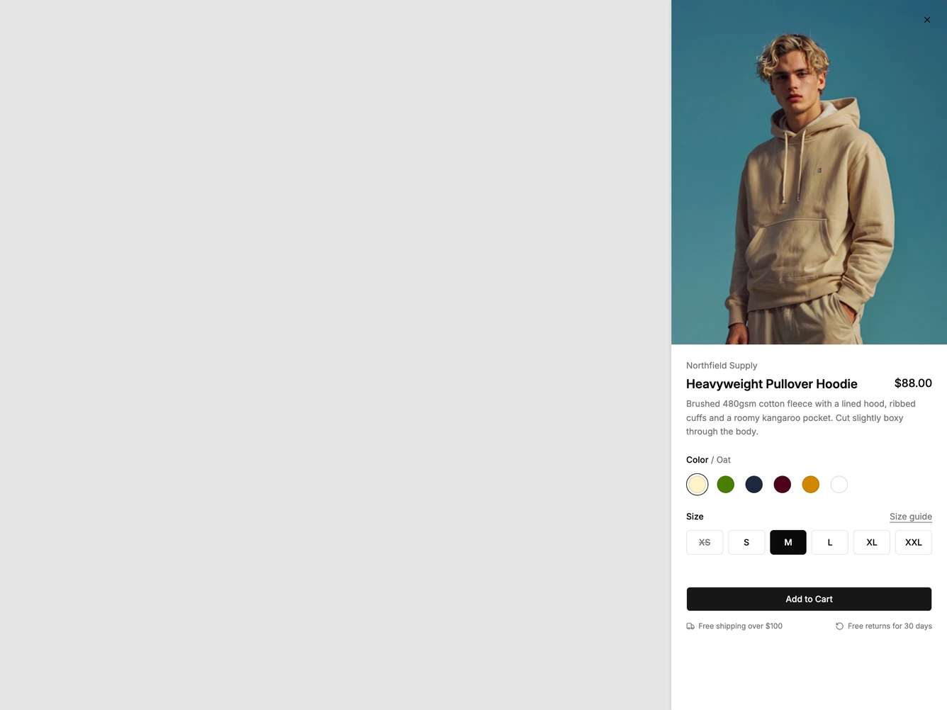
A Shadcn UI quick view that slides in from the right as a narrow, single-column sheet. A tall portrait photo of a model fills the top edge to edge. Below it sit the brand name, the product name with the price aligned to the right, a short description, a row of round color swatches with the chosen color named in the legend, a six-column size grid with a size guide link, a full-width Add to Cart button and two small shipping and returns notes.
Choosing a swatch crossfades the photo to the model wearing that colorway and updates the price, so a discounted color shows its sale price beside the struck-through original. Sold-out sizes are struck through and can't be picked, and the largest size adds a small surcharge with a one-line note explaining it. The surfaces are flat and neutral, with hairline borders on the size tiles, a filled tile for the selected size and a thin ring around the selected swatch.
This is a focused, fashion-led take on the quick view that leans on photography rather than a carousel. It needs one photo per colorway shot in the same pose so the crossfade reads as the garment changing color. The colorways, prices, sizes, surcharges and notes are all props, and the controls are native radio groups that work with the keyboard.
On small screens the sheet takes most of the width and the whole panel scrolls, keeping the photo on top.