

Product List 40 block design & features
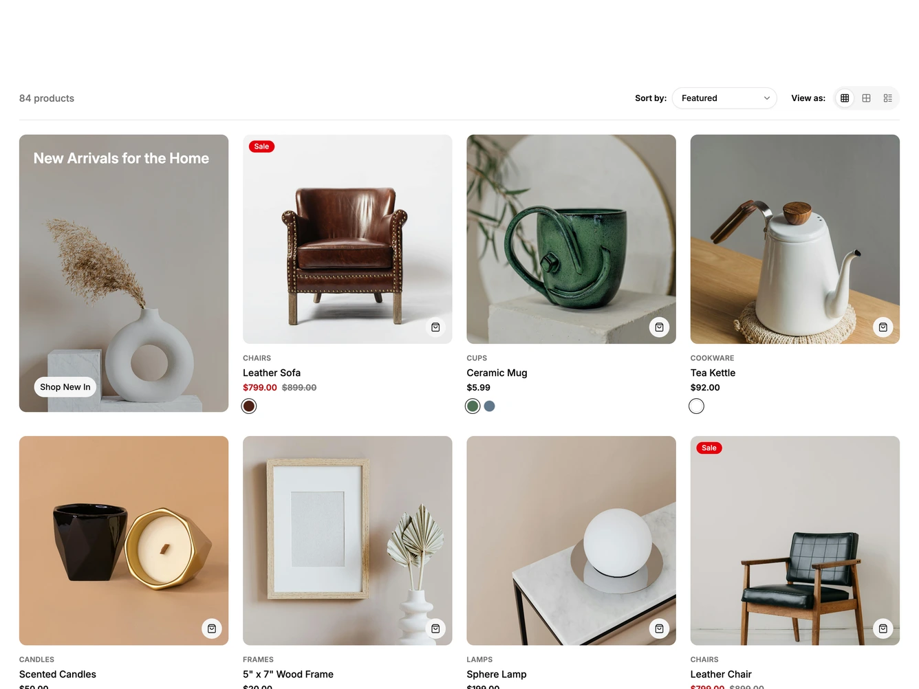
A furniture and homeware product list with a sticky toolbar holding the product count, a working sort menu and a three way view switcher. Cards show a category label, name, sale and regular pricing, badges and color swatches, with a "New Arrivals for the Home" promo tile leading the grid.
Switching between the four column grid, the two column large view and list rows morphs every card in place. Each card and image uses motion layout animation so photos resize and glide to their new positions, text moves with position-only layout to avoid stretching, and the switcher indicator slides between options with a shared layoutId. In list mode a description, the selected color name and Add to cart and Quick view buttons fade in once the cards settle, and the promo tile flattens into a wide banner. Sorting reuses the same layout animation, so cards travel to their new order.
Products, the promotion, the count label and the default view are props, with the furniture set as default data. Built with shadcn/ui Select, Button and Badge plus motion/react, and reduced motion users get instant layout changes with a simple fade.
On mobile the grid view becomes two columns, the large view a single column, and list rows keep a compact thumbnail with the price, swatches and an Add to cart button beside it.