

Product List 36 block design & features
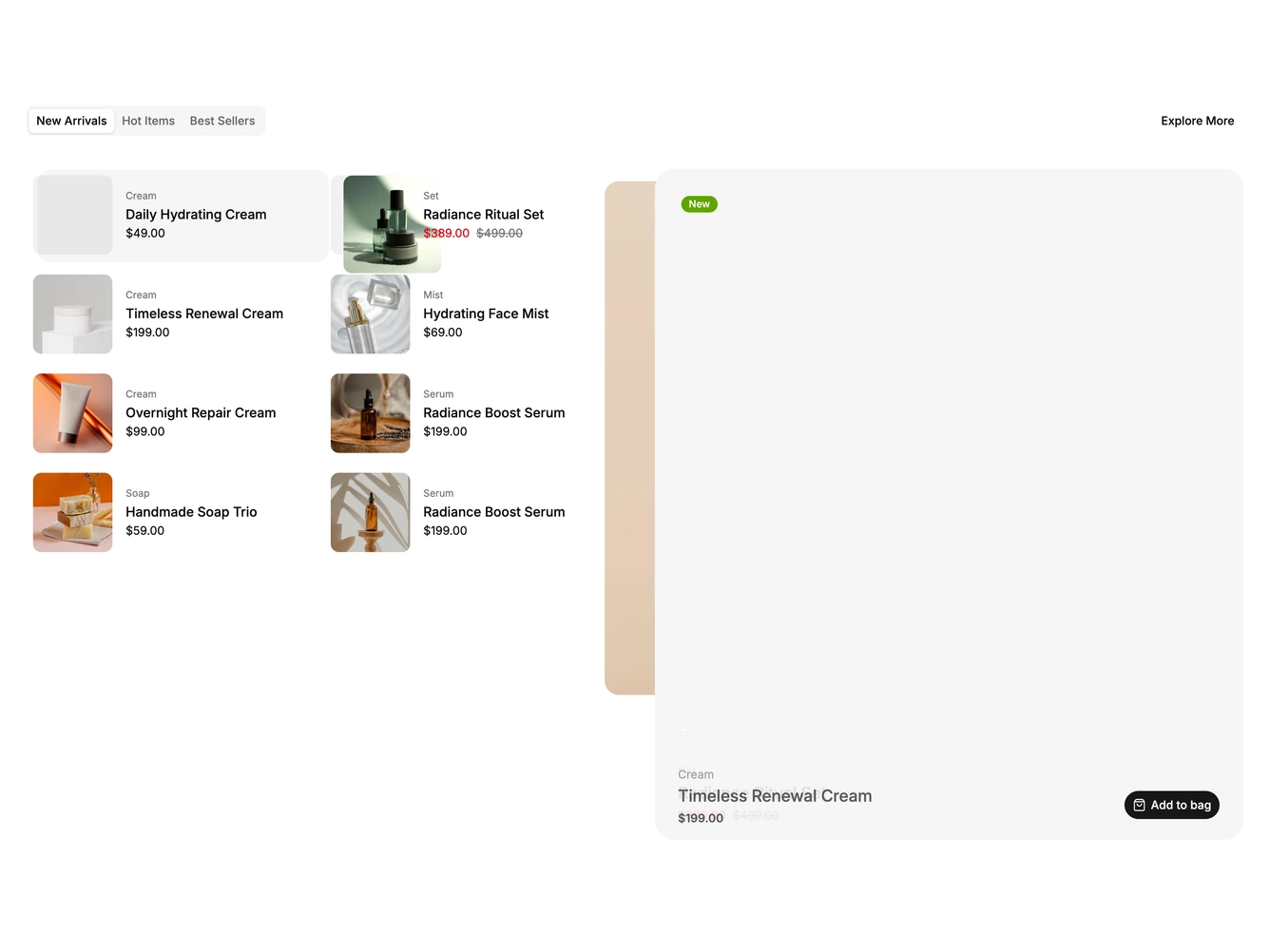
A tabbed layout with a compact two-column list of thumbnails, categories, names and prices on the left and a large sticky stage on the right. The stage shows the selected product's photo, badges, name, price and an add to bag button.
Hovering or keyboard focusing a row selects it, and its thumbnail flies into the stage through a shared layout animation while the previous product returns to its row. A highlight slides between rows. When idle the stage steps through the list on a timer shown as a thin progress bar, pausing on hover or keyboard focus. The interval is a prop; the product lists are data.
Built with shadcn/ui Tabs, Badge and Button. On phones the stage sits above a single-column list and tapping a row selects it, scrolling the stage back into view if needed. With reduced motion the stage crossfades and autoplay is off.