

Product List 34 block design & features
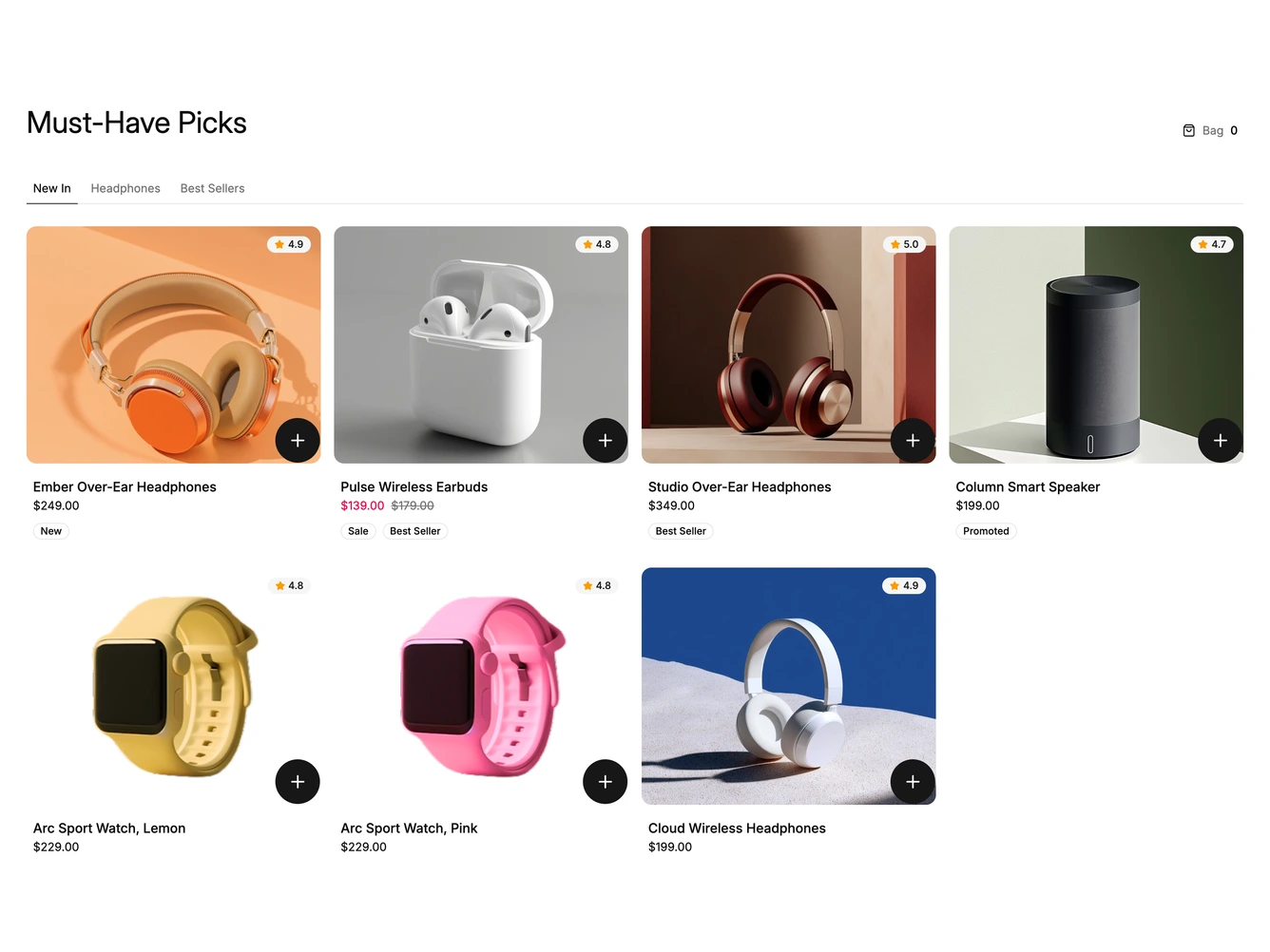
A tabbed product grid of headphones, earbuds, speakers and watches. Each card shows a photo, rating, name, price and tags, with a round add button on the image and a bag count beside the heading.
Pressing add widens the card across two columns with a motion layout spring, and the other cards slide into their new places. Color swatches, a quantity stepper and an add button stagger in. Adding collapses the card, morphs the plus icon into a check, shows how many are in the bag and rolls the header count up. Products, colors and prices live in a data array; the bag lives in local state.
Built with shadcn/ui Tabs, Button and Badge. On phones the grid is two columns and the open card spans the full width, so the picker sits beside the photo. Escape or the close button collapses it and returns focus to the add button.