

Product List 29 block design & features
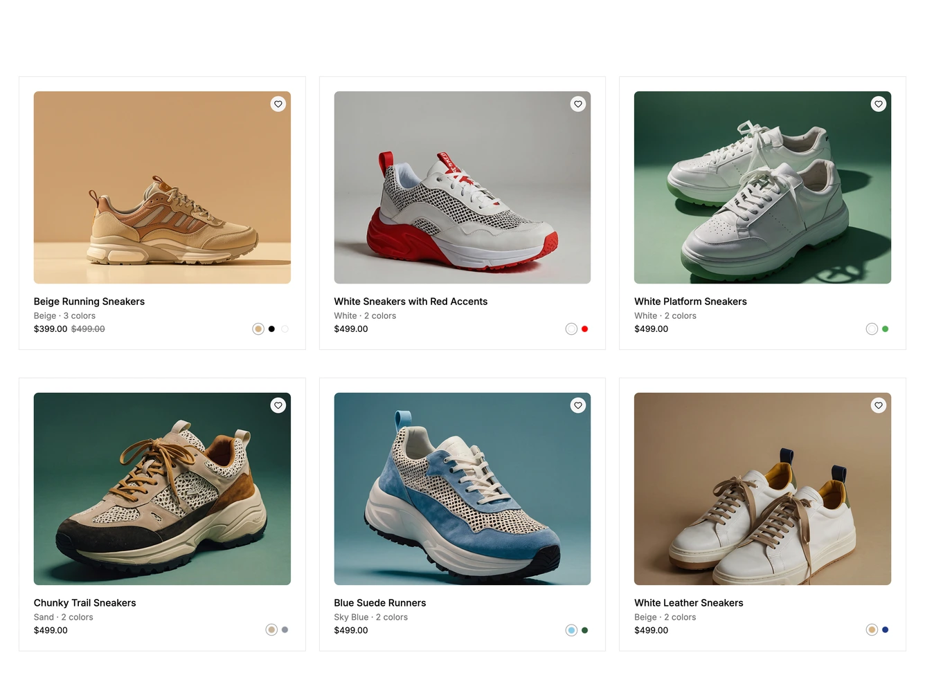
A three column grid of compact, borderless product cards built with shadcn/ui Card. Each card has a rounded photo with a round wishlist button in its top right corner that fills when pressed.
Below the photo sit the product name, the current color and color count, and the price, with any original price struck through. A row of color swatches previews each colorway: hovering or focusing a swatch crossfades the photo and names the color, clicking keeps it, and moving away returns to the chosen color. The fade is skipped when reduced motion is preferred.
The grid drops to two columns and then one on smaller screens. The products, prices and colorway photos come from a data constant at the top of the file.