

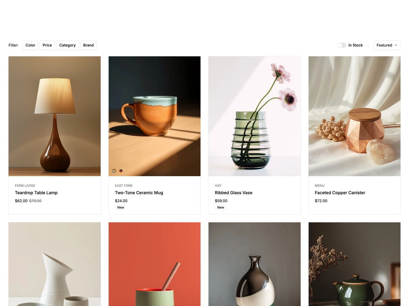
Product List 28 block design & features
A toolbar holds filter chips for color, price, category and brand, an In Stock switch and a sort select, built with shadcn/ui Dialog, Accordion, Switch and Select. Below is a four column grid of cards with a portrait photo, the brand, the product name, the price and a New badge where relevant.
Each chip opens a filter dialog with that group expanded, plus Reset and Apply buttons. Some cards show small color swatches over the photo that switch the product image, and hovering a card fades to a second photo and shows a quick view button. When the toolbar scrolls out of view, a floating Filter button with the active filter count appears at the bottom of the screen. Under the grid, a line of text and a progress bar show how many products are loaded above a See More button.
Below desktop width the chips collapse into a single Filter button. On phones the In Stock switch is hidden, the grid stacks into one column, and the quick view button stays visible in the corner of each photo. The filters, brands and products come from a data constant at the top of the file.