

Product List 25 block design & features
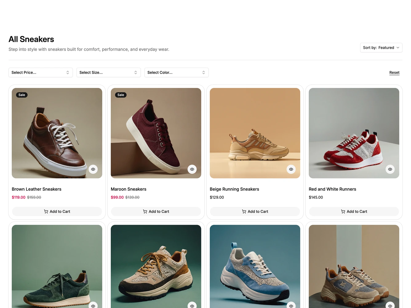
A heading and short description sit above a hairline, with a Sort by select on the right. Below are three filter selects for price, size and color and a Reset link, built with shadcn/ui Popover, Command, Checkbox and Pagination.
Each filter opens a searchable list of checkbox options, and color options show a swatch. Selected values appear as badges inside the select. The grid shows rounded cards with a square photo that fades to a second image on hover, a Sale badge where relevant, an eye button for quick view, the product name, the price and a full width Add to Cart button. Numbered pagination sits under the grid.
Below desktop width the selects become compact buttons that mark active filters with a dot and open the same searchable lists in a drawer from the bottom. The filters, sort options and products come from a data constant at the top of the file.