

Product List 24 block design & features
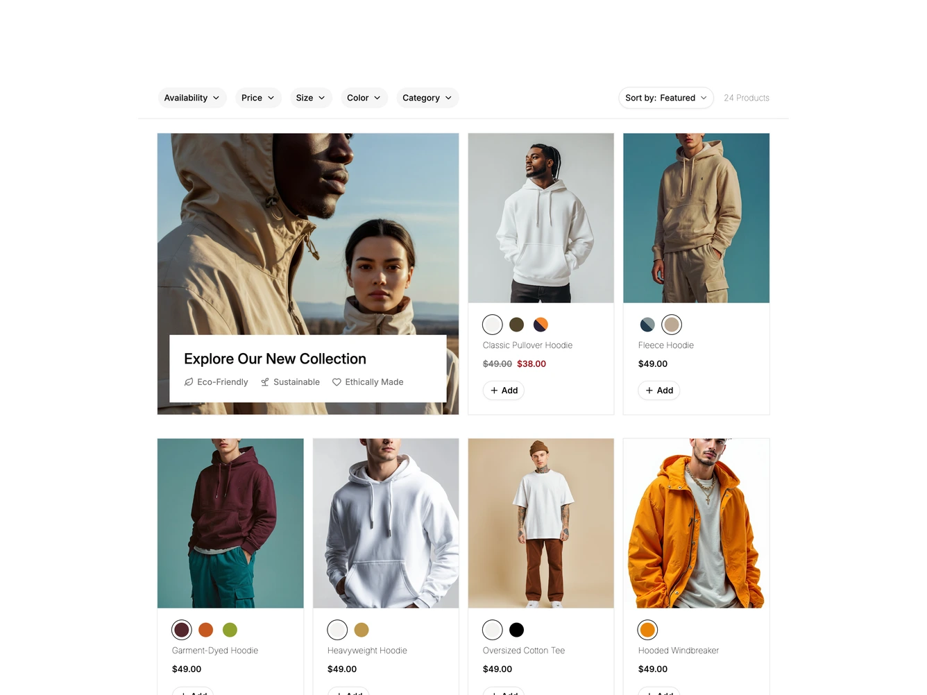
A row of pill dropdowns for availability, price, size, color and category sits above the grid, with a Sort by menu and the product count on the right, built with shadcn/ui Popover, Progress and Sheet. The grid opens with a double width photo tile carrying a white panel with the collection title and three small sustainability notes.
Product cards show a photo that fades to a second image on hover, round color swatches with tooltips that switch the photo, the product name, the price with any original price struck through and an outlined Add button. Under the grid, a line of text and a progress bar show how many products are loaded above a rounded See More button with the remaining count.
Below desktop width the dropdowns and sort menu are replaced by a Filter button that opens a sheet from the left with sort options and every filter group, plus Apply and Clear All buttons. Chosen filters show as removable chips under the toolbar. The filters, promotion and products come from a data constant at the top of the file.