

Product List 21 block design & features
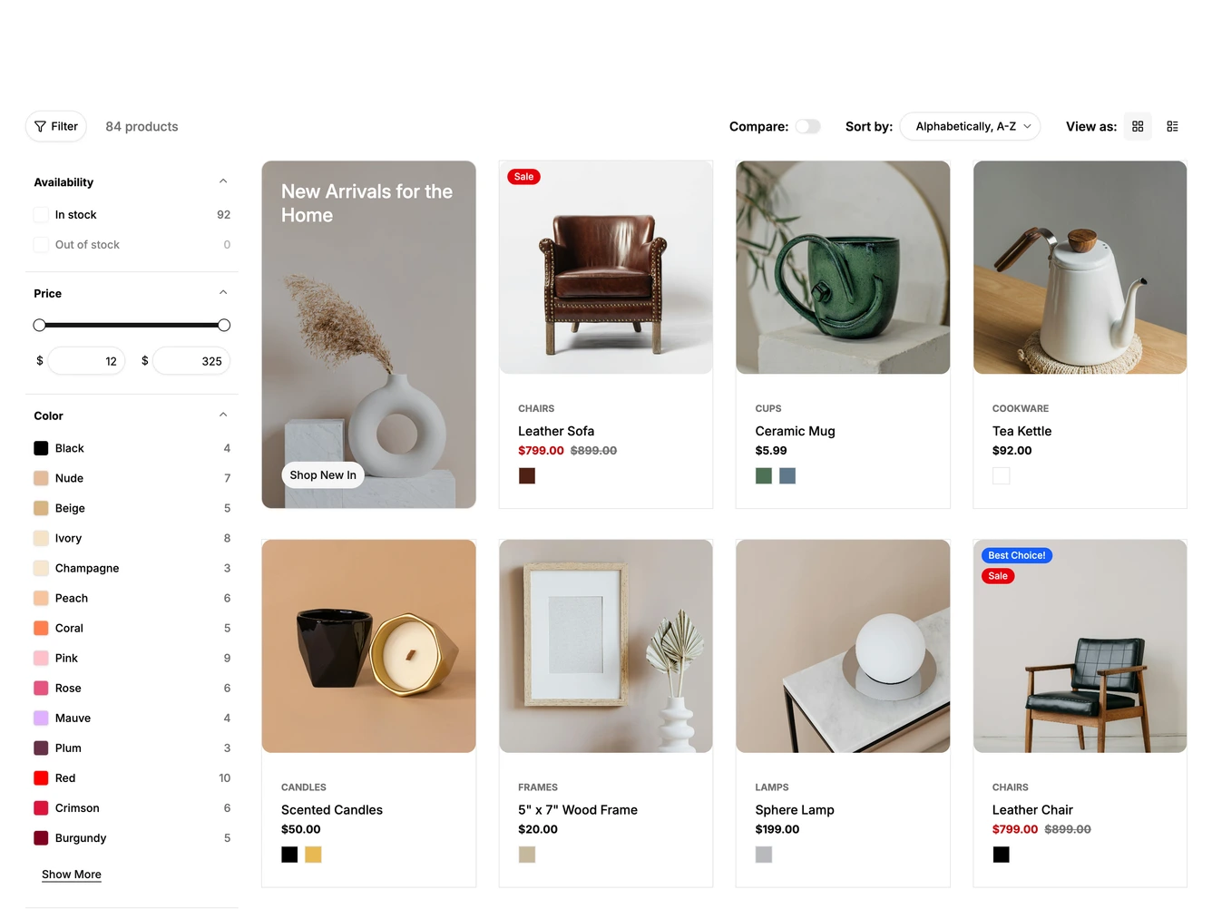
A toolbar along the top holds a Filter button with the product count, a Compare switch, a Sort by select and grid and list view toggles, built with shadcn/ui. Below, a sidebar of collapsible filters for availability, price, color and category sits beside a four column grid that opens with a promotional photo card.
The Filter button collapses the sidebar so the grid spans the full width. Product cards swap to a second photo on hover, reveal an Add to cart button, and show color swatches that switch the photos when hovered. The list view lays each product out as a row with its actions on the right.
Turning on Compare adds a checkbox to every card and opens a tray along the bottom with slots for up to five products, a Compare button and Clear All. The filters, products, promotion and sort options come from a data constant at the top of the file.
Below the extra large breakpoint the sidebar moves into a sheet that opens from the left with an Apply button, and the grid drops to three columns. On tablets and phones the sort select moves into that sheet, the grid shows two columns and cards use a small bag button.