

Product List 20 block design & features
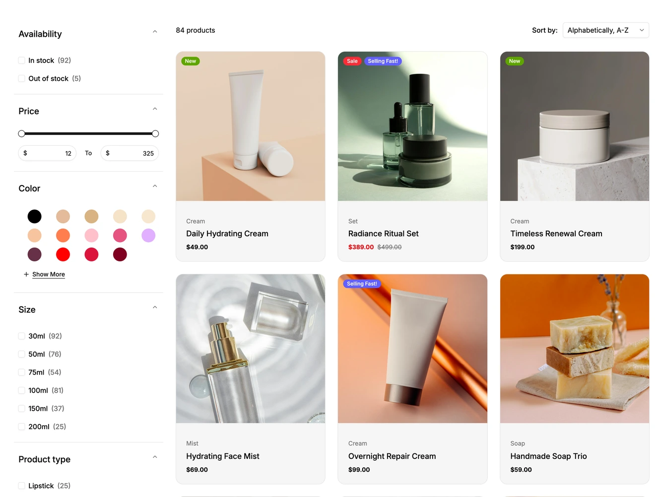
The page pairs a filter sidebar with a product grid, built from shadcn/ui Accordion, Slider, Select, Sheet and Pagination. The sidebar has collapsible sections for availability, a price range slider with min and max inputs, round color swatches with a Show More toggle, sizes and product type, each with option counts.
Above the grid sit a product count and a Sort by select. Chosen filters appear as removable chips with a Remove All link. The grid shows rounded cards with a photo, colored badges, the category, the product name and the price, and hovering a card slides in a Quick View button and a search icon button. Numbered pagination sits below the grid.
Below desktop width the sidebar is replaced by a Filter button that opens the same filters in a sheet from the left with an Apply button. On phones the count and sort select are hidden, cards show a bag button instead, and a toggle switches the grid between one and two columns. The filter groups, sort options and products come from a data constant at the top of the file.