

Product List 17 block design & features
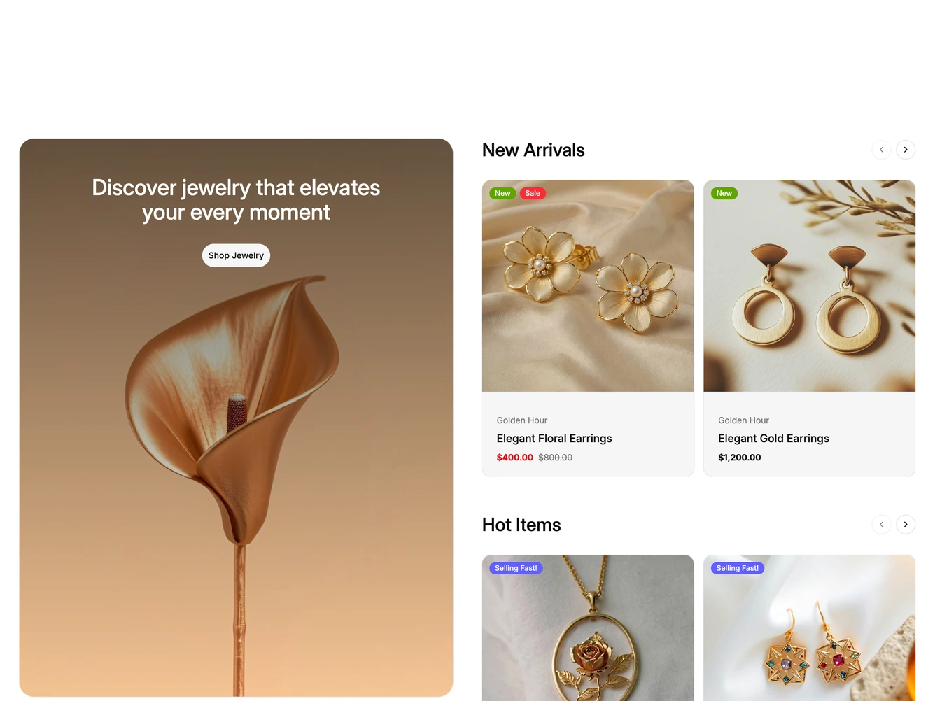
A tall rounded promotional card sits on the left with a photo, a white heading and a pill button, built with shadcn/ui Card and Button. On the right are three stacked carousels titled New Arrivals, Hot Items and Best Sellers, each showing two product cards at a time.
The product cards have a square photo with colored badges such as New, Sale, Selling Fast or Sold out, then a soft gray panel with the collection, the product name and the price. Each carousel has its own round arrow buttons next to its title, and hovering a card slides in a Quick View button and a search icon button.
On desktop the promotional card stays pinned while the carousels scroll past it. The promotion, lists and products all come from a data constant at the top of the file.
On smaller screens the promotional card stacks above the carousels and a slide counter appears between the arrows. On phones each carousel shows one card at a time and the hover buttons give way to a small bag button.