

Product List 16 block design & features
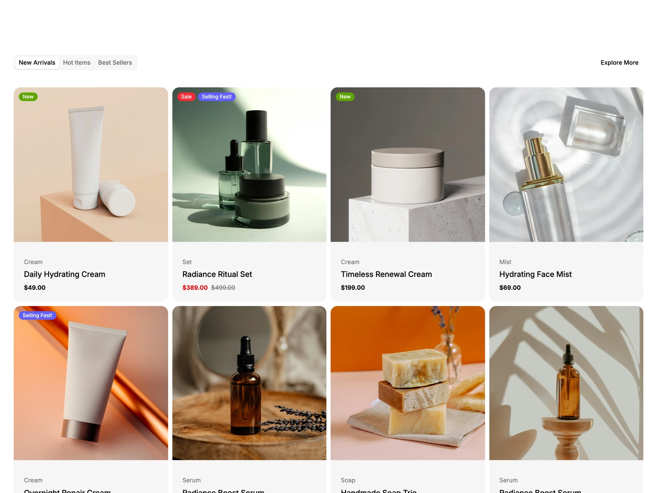
A row of pill tabs for New Arrivals, Hot Items and Best Sellers sits on the left with an Explore More link on the right, built with shadcn/ui Tabs. Each tab shows a grid of rounded cards with a square photo above a soft gray panel holding the category, the product name and the price.
Small colored badges such as New, Sale and Selling Fast sit in the top left of the photos, and sale prices show in red beside the struck-through original. On desktop, hovering a card slides up a Quick View button, and the cards fade in one after another when a tab opens.
The grid moves from one column on phones to two, three and four columns as the screen widens. On phones the Quick View button is replaced by a small bag button in the corner of each photo and the Explore More link is hidden. The tabs and products come from a data constant at the top of the file.