

Product List 15 block design & features
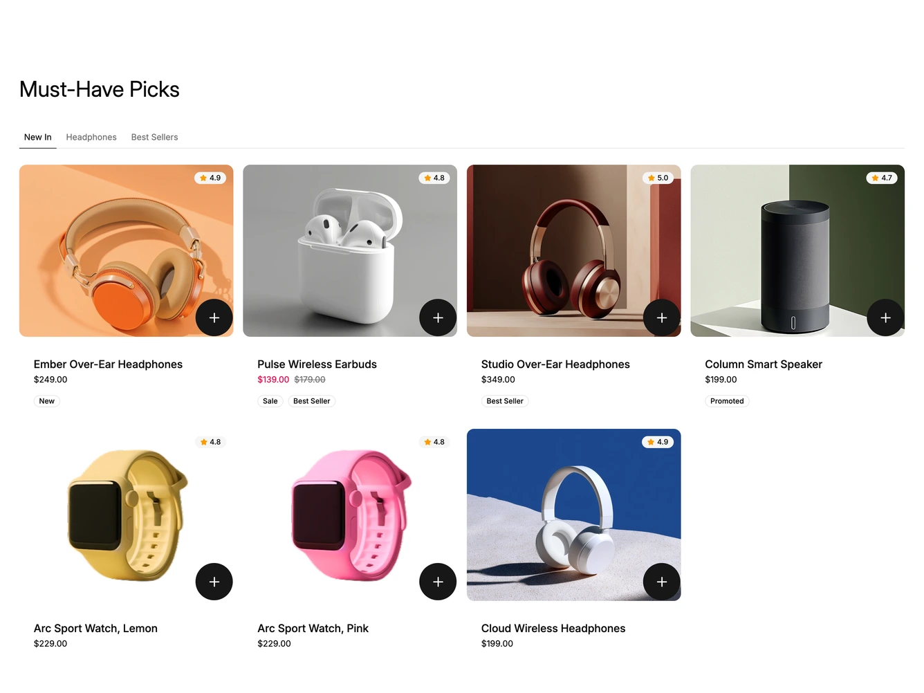
A heading sits above a row of underlined tabs for New In, Headphones and Best Sellers, built with shadcn/ui Tabs. Each tab shows its products as cards with a rounded photo, the product name, the price and a row of outlined tags such as New, Sale or Best Seller.
Every photo carries a star rating in the top right and a large round add button in the bottom right. On desktop a quick view eye button fades in at the top left when a card is hovered. Sale prices show in a highlight color next to the struck-through original.
On larger screens the cards sit in a three or four column grid. Below that the same cards become a swipeable carousel with the next card peeking in, and on phones the quick view button stays visible. The tabs and products come from a data constant at the top of the file.