

Product List 14 block design & features
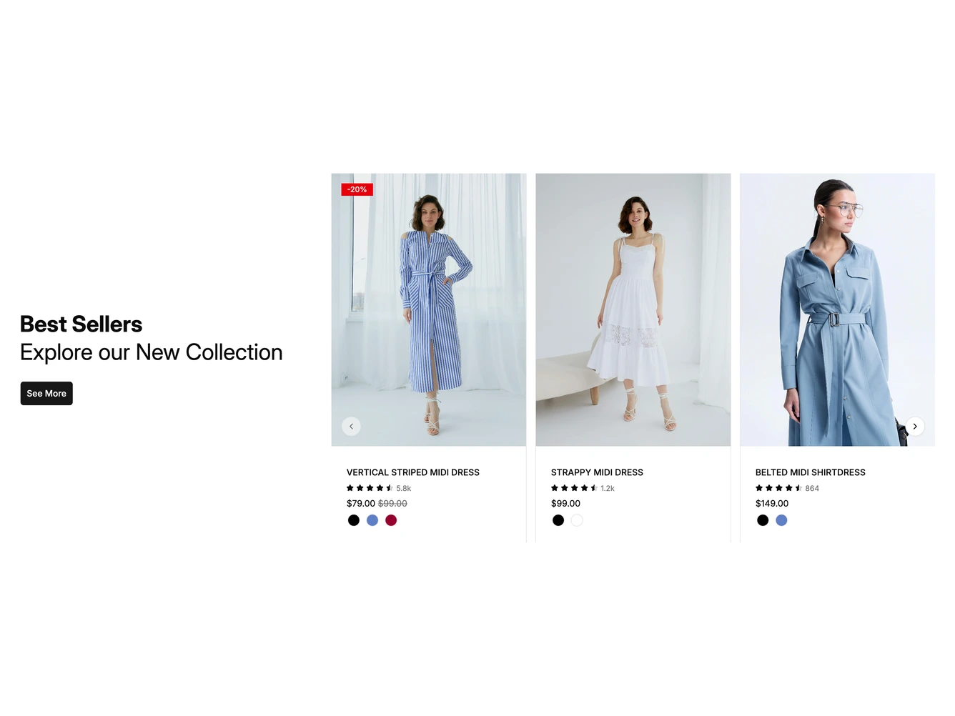
A heading block on the left pairs a bold Best Sellers title with a lighter line underneath and a See More button. To the right, a shadcn/ui Carousel shows three portrait product cards at a time.
Each card has a model photo with an optional discount badge, the product name in capitals, a star rating with a review count, the price with any original price struck through, and a row of round color swatches. Round arrow buttons sit inside the left and right edges, centered on the height of the photos.
On desktop a round bag button fades in over the photo when a card is hovered, and on touch screens it stays visible. The products, badges, ratings and colors come from a data constant at the top of the file.
On phones the heading block stacks above the carousel, which shows one card at a time.