

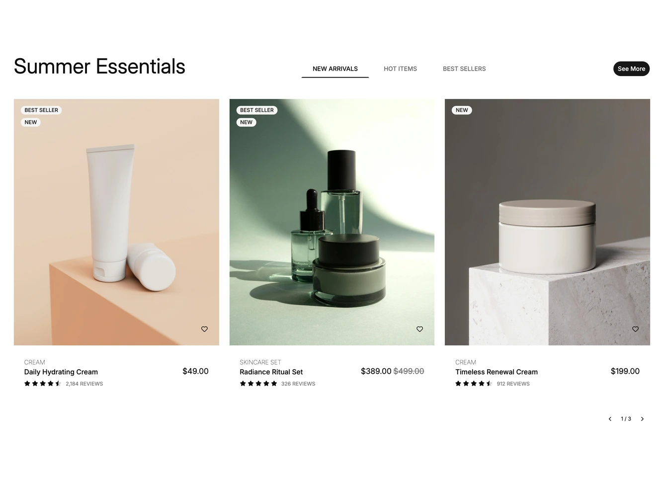
Product List 13 block design & features
A large heading sits on the left, a row of underlined tabs in the middle and a See More button on the right. Below, built with shadcn/ui Tabs and Carousel, each tab holds its own carousel of three large product cards.
Each card has a square photo with stacked badges such as Best Seller and New, a heart button and a bag button. Under the photo are the category, the product name beside the price with any original price struck through, and a star rating with a review count.
Hovering a card fades to a second photo and slides up the bag button and a Quick View button. On desktop, arrow buttons with a page counter sit under the carousel. Switching tabs swaps in that tab's products, and every list, badge and rating comes from a data constant at the top of the file.
On smaller screens the tabs center under the heading, the carousel shows one card at a time and the See More button moves to a full-width button under the cards.