

Product List 11 block design & features
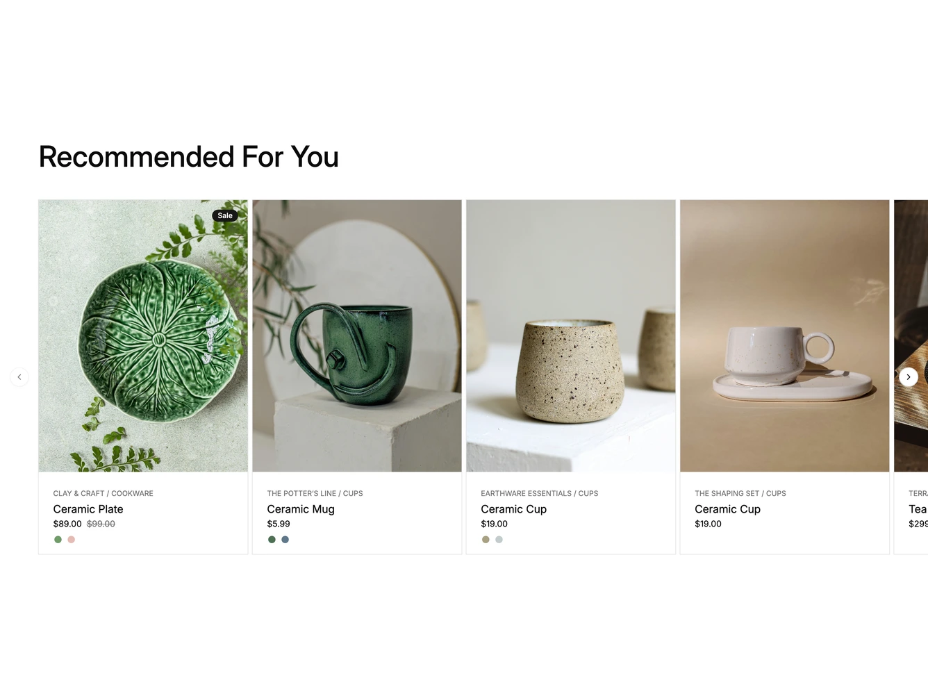
A heading sits above a horizontal carousel of tall product cards built with shadcn/ui. Each card has a portrait photo with an optional Sale badge in the corner, then a collection and category line, the product name, the price with any original price struck through, and a row of small color swatches.
Hovering a card fades to a second photo and slides up a Quick View button over the image. Choosing a swatch switches the card to that variant's photos. Round arrow buttons sit at either side of the carousel, and the number of cards it moves per click grows with the screen width.
The products, variants, prices and images come from a data constant at the top of the file. On phones the carousel shows one card at a time, and below desktop width the Quick View button becomes a small eye icon in the corner of the photo.