
Pricing 93 block design & features
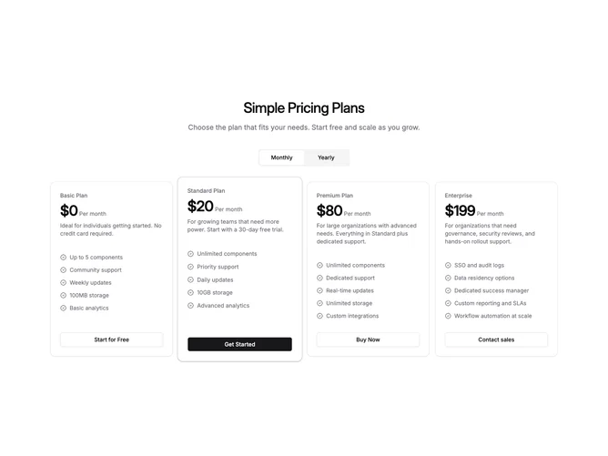
Pricing93 is a four-tier pricing section built with shadcn/ui Card, Button, and ToggleGroup components. A centered headline and optional description sit above a pill-shaped billing toggle that switches between monthly and yearly pricing. Below the toggle, four plan cards arrange in equal columns on desktop. The highlighted plan uses a slight scale-up, a colored primary ring, and a drop shadow to break the uniform row and pull visual focus.
Each card contains the plan name in muted text, a large price figure with a cadence label, a short description that updates with the billing cycle, a capped feature checklist with badge-check icons, and a full-width CTA link button. The highlighted card gets a solid primary button while the remaining plans use outlined variants.
The overall feel is restrained and functional, close to a default shadcn card grid with the spotlight column as the single decorative accent. The scale and ring treatment on the featured plan creates a subtle asymmetry without heavy decoration. Moderate complexity, driven mainly by the billing state toggle and the conditional spotlight styling.
On smaller screens the four columns collapse to a single stacked column, preserving the spotlight styling on the highlighted card without layout changes.