
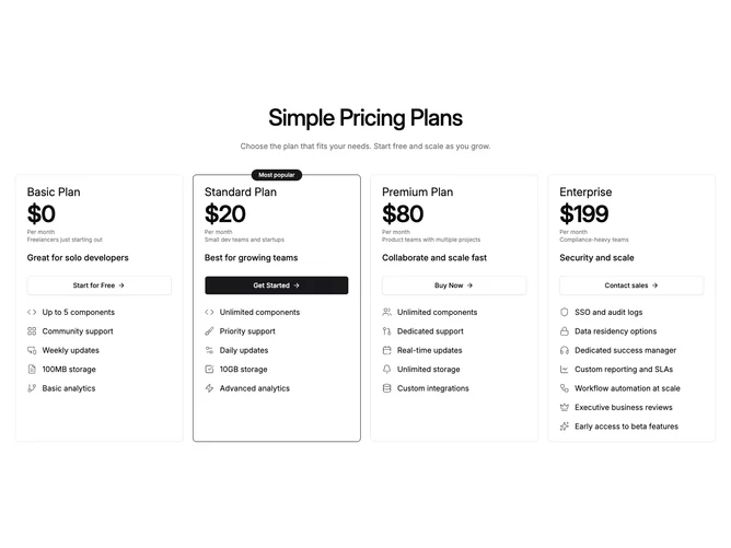
Pricing 89 block design & features
This block uses shadcn/ui Button with Lucide feature icons resolved from the shared plan data. Four bordered panels sit in one row on desktop and stack on smaller breakpoints. Each panel repeats plan name, a large monthly price, cadence and best-for lines, a short tagline pulled from monthly description by default, a large ArrowRight CTA, and a vertical list where each feature row may supply its own icon or fall back to a simple check.
The highlighted plan keeps the same border treatment as the three-plan source but adds a centered pill badge pinned halfway above the card edge, using the configurable highlighted label string.
Typography is marketing-forward with strong numerals and minimal chrome beyond borders. No billing toggle appears, so copy should align to the monthly numbers shown. Complexity is moderate due to optional per-row icons and the floating badge positioning.
Mobile readers see full-width panels in sequence; spacing between cards stays consistent through the grid gap utilities.