
Pricing 38 block design & features
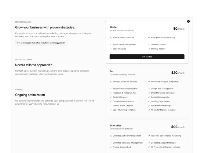
Pricing38 is a two-column pricing section built with shadcn/ui, wrapped in a double-bordered container with a muted tint. The left column stacks three content blocks separated by short horizontal separators, each with an uppercase label, a heading, and a description paragraph. The first block includes an alert component with an info icon. The right column contains a radio group of three selectable plan cards for Starter, Pro, and Enterprise, each showing a plan name, subtitle, price, separator, two icon-labeled highlights, another separator, and a two-column feature checklist with check icons. The selected card gains a ring border and background change, with a small check circle badge at the corner and a CTA button that animates into view.
Plan cards use hidden radio inputs inside label wrappers, relying on CSS has-selectors to style the checked state. The selected card transitions its border to ring color, shifts to the default background, and reveals a "Get Started" button through a max-height animation. Feature rows are arranged in a two-column grid within each card.
The overall aesthetic is structured and information-dense, combining editorial-style left-column copy with interactive right-column plan selection. Complexity is higher because the layout pairs multiple left-column content blocks with three detailed radio-selectable cards, each containing separators, icon highlights, and feature grids.
On smaller screens the two columns stack vertically, placing the descriptive copy above the plan selector cards.