
Pricing 15 block design & features
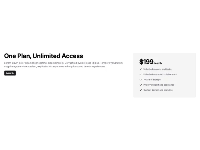
Pricing15 is a single-plan pricing section built with shadcn/ui, split into two side-by-side columns. The left column takes up roughly two-thirds of the width and contains a large bold heading, a description paragraph, and a subscribe button. The right column holds a bordered card on a muted background displaying the price in oversized bold numerals with a period suffix, followed by a vertical feature list with check icons.
The heading uses balanced text wrapping at a large size, while the description sits in muted foreground at a comfortable reading size. The subscribe button uses the default primary variant at a large size. Inside the right card, features are listed vertically with check icons on the left and muted-foreground text on the right, giving a clear at-a-glance summary of what the plan includes.
The approach is minimal and direct, presenting one plan without any tier comparison or billing toggle. Complexity is low because you configure a single plan object with price, features, and button text. The two-column split keeps marketing copy separate from the pricing detail.
On smaller screens the two columns stack, placing the heading and CTA above the pricing card.