

Pricing 14 block design & features
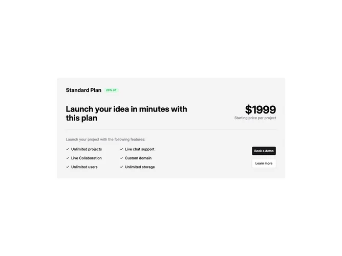
Pricing14 is a single-plan pricing section built with Shadcn UI, rendered inside a wide muted-background container. At the top, the plan name sits beside an optional discount badge with a green-tinted outline. Below that, a large heading and the price with a period note are arranged side by side, followed by a separator. The lower portion shows an optional feature-list label, a two-column checklist of features with check icons, and a vertical stack of two buttons on the right for primary and secondary actions.
The badge uses a custom green border and background to call attention to the discount. The price renders in bold oversized numerals with a smaller muted note beneath. Features are laid out in a two-column grid with generous horizontal gaps, each item pairing a check icon with the feature text. The primary button uses the default variant while the secondary uses outline, both at the large size.
Visually this is a wide, horizontal single-plan card rather than a narrow centered one. Complexity is moderate because you supply a plan object with name, price, badge text, features array, and two button configurations. The muted container and separator give it a sectioned feel.
On smaller screens the heading and price stack vertically, the feature grid collapses to a single column, and the buttons move below the features.