

Pricing 11 block design & features
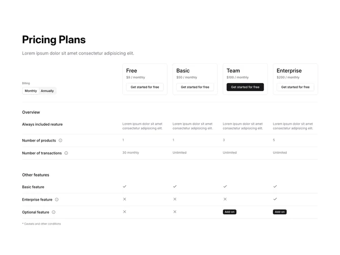
Pricing11 is a four-plan feature comparison matrix built with shadcn/ui. A left-aligned heading and description sit at the top, followed by a sticky header row containing a billing-period tab switcher on the left and four bordered plan cards on the right, each showing the plan name, price, and a CTA button. Below the header, features are organized into named category sections, with each feature row spanning a six-column grid where the first two columns hold the feature name and an info tooltip icon, and the remaining four columns show inclusion values as text, check icons, X icons, or add-on badges.
The sticky header keeps the plan names and prices visible as users scroll through the feature rows. The recommended plan uses a primary button variant while others use outline buttons. Feature inclusions vary between plain text values, boolean check/X icons, and badge labels for add-on availability, giving granular control over how each cell is presented. A small caveat footnote sits below the comparison grid.
The overall pattern is a dense, data-table style comparison suited for products with many features to differentiate across tiers. Complexity is high because you define a full feature matrix with per-plan inclusion objects, category groupings, and mixed content types per cell.
On mobile the six-column grid is replaced by collapsible rows for each feature, with a chevron trigger that expands to reveal plan-by-plan values in a stacked list format.