

Pricing 10 block design & features
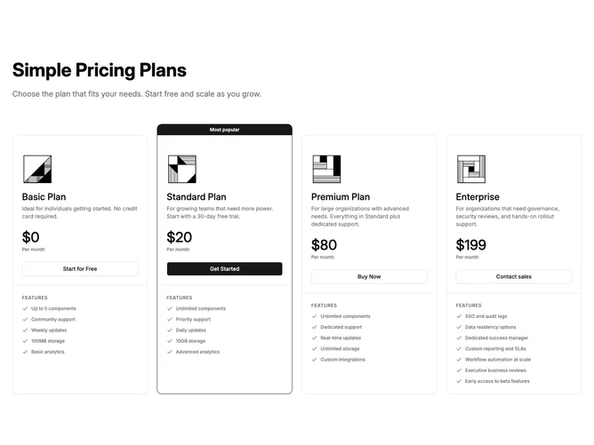
Pricing10 is a four-plan pricing section built with Shadcn UI, placed beneath a left-aligned heading and optional description. Each plan renders as a bordered, rounded card containing the plan name, a short description, an optional image, the monthly price, a full-width CTA button, and a lower section with grouped feature lists separated by uppercase category headings. The highlighted plan receives a primary-colored top banner with a label such as "Recommended" and a primary border, while other cards use the default border and sit slightly lower.
Highlighted cards use a solid primary button while the remaining cards use outline buttons. Prices display in medium-weight numerals with a smaller period line beneath. Feature groups each carry an uppercase muted heading followed by a vertical list of items with small icons, keeping the scan pattern consistent across all four columns.
The aesthetic is structured and information-dense, suited for products that need to show categorized feature breakdowns per tier rather than flat checklists. Complexity is higher than a basic plan grid because each plan object can include optional images and multiple named feature groups with custom icons.
On smaller screens the four columns collapse to a single stacked column, and the card header switches to a side-by-side layout of image and text before reverting to vertical stacking at the narrowest widths.