
Login 7 block design & features
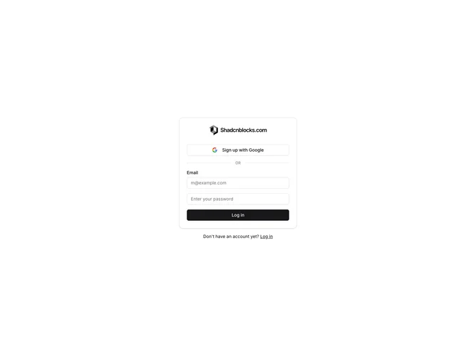
Login7 is a centered login form rendered inside a shadcn/ui Card component with CardHeader and CardContent sections. The header displays a linked logo icon alongside a bold brand name. CardContent contains an outline Google sign-up Button, a horizontal divider with "OR" text, a labeled email Input, a password Input, and a full-width primary submit Button. Below the card a text line links to account creation.
The Card uses its default border and background with no extra shadow, sitting centered within the page container. The divider is built from two thin horizontal spans flanking a small muted "OR" label. Buttons and inputs follow standard Shadcn UI styling with consistent spacing inside the grid layout. The card is constrained to a maximum width of 380 pixels.
Compact and conventional, this variant uses the Card component explicitly to give the form a contained, panel-like appearance. Complexity is very low with no form validation, no state logic, and only static elements. The block requires no props beyond className.
The narrow fixed-width card centers naturally at all viewport sizes without needing responsive layout changes.