
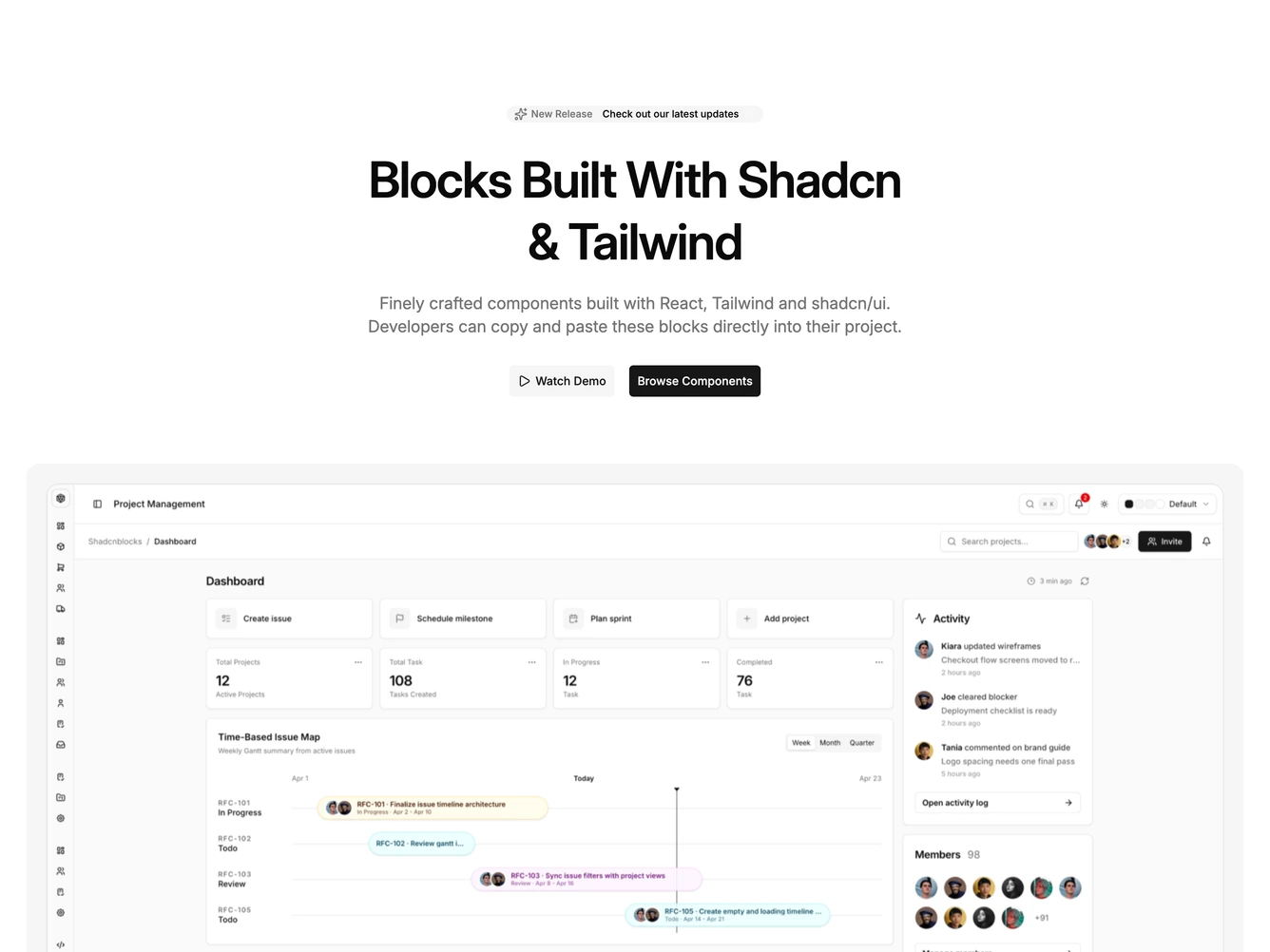
Hero 114 block design & features
Hero114 is a full-width hero built with shadcn/ui. Centered content opens with a pill badge combining a sparkles glyph, short release note, and small text link with exit icon. The headline and supporting paragraph stay centered with generous vertical rhythm, followed by a secondary watch-demo control with play icon and a filled primary button. The demo control is wired to open a dialog that plays a 16-by-9 product video.
Below the text, a rounded muted card wraps a wide product screenshot in aspect ratio so the UI reads like a floating device panel. Further down, a muted subheading introduces a carousel of semi-transparent company marks driven by auto-scroll and autoplay plugins for continuous motion.
The aesthetic blends airy marketing type with a tactile framed shot and moving social proof. This is a moderately elaborate hero because of the dialog video and carousel configuration together.
Logo band and screenshot span nearly full container width with padding that grows on desktop.