
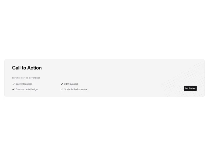

Cta 7 block design & features
Cta7 is a bordered, rounded panel call-to-action built with shadcn/ui on an accent background. A large heading opens the left content column; an optional tagline renders as small uppercase muted text with wide tracking. Up to four feature strings appear in a list with Lucide check icons, two columns on medium viewports and one column when narrow. A large primary Button is anchored toward the lower right on extra-wide layouts.
Behind the content, an SVG dot pattern sits in a clipped absolute layer, rotated and partially off the card to add texture without hiding text. Foreground type uses semibold titles, muted list color, and consistent vertical rhythm between heading, tagline, and list.
The look sits between corporate trust-building and modern SaaS marketing: checklist proof points, decorative but subtle geometry, single strong CTA. It is more structured than a headline-only band because it forces short bullet proof points next to the action.
On viewports below the two-column breakpoint the button sits under the list with bottom margin on the text block; at two columns the button aligns with the second grid track for a deliberate split between messaging and conversion.