Cta 6 block design & features
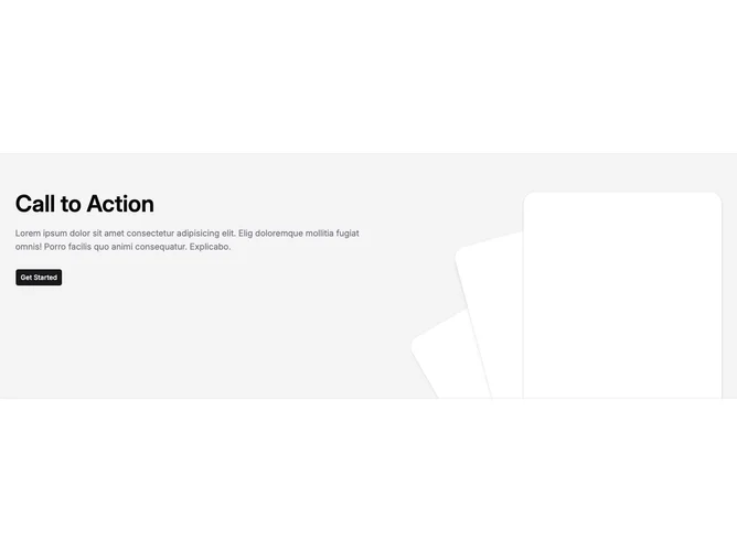
Cta6 is a full-bleed call-to-action built with Shadcn UI inside a section with heavy vertical padding. The content sits in a bordered horizontal band on an accent background. The left side (or top on narrow viewports) carries a large heading, a muted paragraph, and one default Button. The right side is purely decorative: three tall rounded rectangles stacked with different rotations, offsets, and shadow strengths to read like fanning cards.
Visually the block leans on contrast between flat accent fill and faux-card panels that use background color, large radius, and layered shadows. The illustration area is positioned partially below the text on small screens with generous bottom margin so the cards peek into the section. From medium widths up the layout becomes a row with the graphic anchored to the bottom and offset toward the edge.
The aesthetic is graphic and product-marketing oriented rather than minimal documentation chrome. The depth comes almost entirely from those rotated shells rather than photography or icons.
The heading, body paragraph, and button label are hardcoded in the TSX rather than props, and the body still uses Lorem-style placeholder text, so you customize this block by editing source until it matches the content-pack pattern used elsewhere.