
Cta 40 block design & features
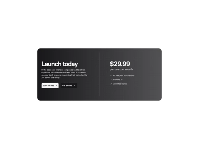
This block is a split-layout call to action built with shadcn/ui inside a wide rounded rectangle filled with a left-to-right primary gradient. One column stacks a large heading, supporting copy, and two desktop buttons embellished with chevron icons; the opposing column headlines with oversized price typography, supplementary rate hinting, then a concise checklist pairing check icons with short lines. The whole card rests on neutral page backing so gradient saturation reads as deliberate.
A masked repeating plus motif sits underneath at low contrast, weakening toward one side so text and checklist stay readable. Typography flips to light-on-primary with stepped opacity for supportive lines. Button treatments mix secondary shells and brighter fills calibrated for gradient legibility, and narrower breakpoints tuck another full-width action stack beneath the checklist so thumbs can reach mirrored choices.
Product-marketing in tone and moderately elaborate, this block merges pricing cues with persuasive copy and dual intents such as signup versus talk-to-sales flows. Complexity is elevated relative to minimalist call to action blocks because of gradient management, patterned backdrop, duplicated mobile actions, and iconography pacing.
Small screens reorder into a dense vertical rhythm while keeping spacing comfortable and the motif subdued enough not to overpower numbers or bullets.