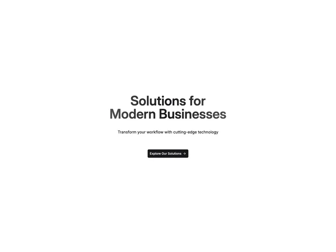
Cta 31 block design & features
This is a single-column centered call to action built with shadcn/ui inside a padded section. The headline uses a left-to-right gradient clipped to the text, with a line break in the middle of the phrase. Below it sit a short supporting sentence, then a large primary button with an arrow icon. Behind the text, two wide horizontal clusters of small circular logo frames curve outward from the center, each logo in a thin outlined circle with varied scale so the row feels organic rather than grid-like. A horizontal band with gradient from the page background fades the logo field at the left and right edges so the center stays readable.
The layout relies on primary-tinted gradient text, default body color for the subline, and flat circular logo treatments with hairline borders. Vertical spacing is generous between headline, subtext, and button. The section does not use a card or solid panel; depth comes from overlapping the logo arcs under the copy and the edge-fade overlay. Static presentation with no motion beyond default button hover behavior.
This reads as a moderate-complexity marketing call to action: the curved logo placement and gradient headline are more decorative than a plain centered block, but the structure is still one column of copy plus one action. It stands out when you need implied integrations or partners without a formal logo strip row. You would swap the placeholder headline strings, subline, button label, link, and logo image sources for real content.
On smaller viewports the headline scales down and the logo clusters scale and shift so the arc still frames the button; the layout stays centered while the wide logo groups stay clipped within the viewport edges.