Cta 3 block design & features
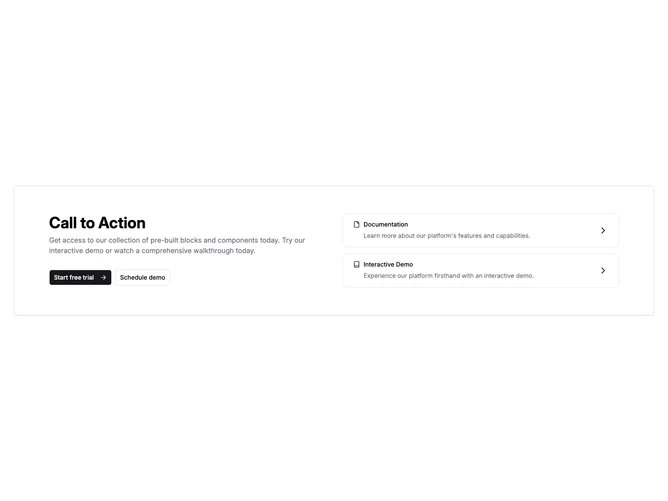
Cta3 is a two-column call-to-action built with shadcn/ui inside a rounded container that carries a light border and soft shadow. The left column stacks a bold heading, a muted supporting paragraph, and a pair of buttons wired as links: primary with a trailing arrow icon and outline secondary. The right column is a vertical pair of full-width linked rows styled as flat cards; each row shows an icon, title, short description, and a chevron to signal navigation.
Visually it stays close to default Shadcn surface styling: neutral backgrounds, hairline borders, and restrained typography scaling between breakpoints. Buttons compress to stacked full-width controls on narrow widths before spreading into a horizontal pair where space allows. Card rows lighten slightly on hover to signal click targets without heavy ornament.
Overall this reads as a practical marketing strip plus auxiliary destinations rather than a single blunt button bar. The mix of primary conversion actions and secondary destination cards adds moderate complexity for teams that want both signup flows and docs-style hops in one band.
On smaller screens the grid collapses to one column so messaging stays readable above the linked rows.