Cta 26 block design & features
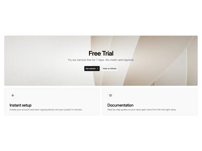
Cta26 stacks a cinematic banner atop two informational cards inside one vertical flow built with Shadcn UI. The banner is a fixed-height rounded rectangle that fills with a full-bleed photograph, then receives a radial wash from solid background toward transparency so centered headline and paragraph stay legible. Primary and secondary large buttons sit beneath the text stack and align centered until small breakpoints flip them into a column.
Muted borders frame both the hero band and the supporting tiles beneath; each lower tile is a whole-card link with icon badge in a squared wrapper, bold title, and muted description. Hover lifts the cards slightly to hint clickability.
This reads premium-product launch thanks to photography-forward storytelling paired with concrete next-step panels. Complexity sits mid-high because you need a strong hero image plus distinct secondary narratives for each card.
Large screens let the radial fade open wider toward transparent edges while narrow widths compress the grid so cards stack with consistent gutters below the banner.