
Compare 9 block design & features
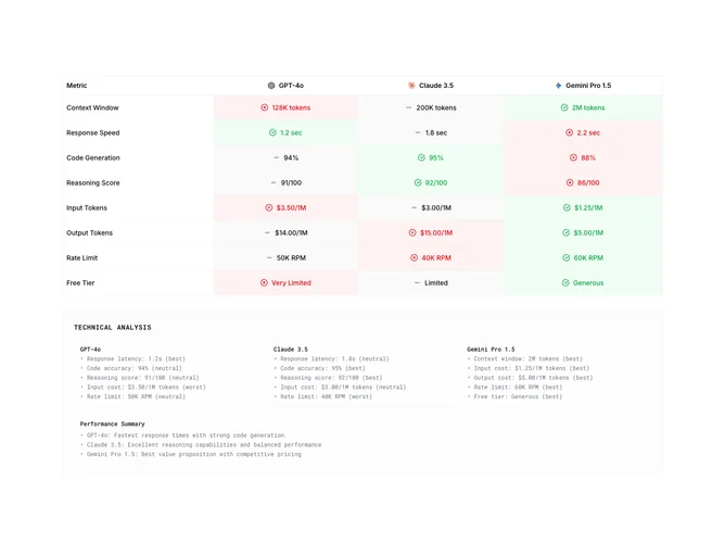
Compare9 bundles a benchmarking table and explanatory appendix built with shadcn/ui. The header row aligns each vendor name with its logo in a bordered, lightly frosted wrapper. Subsequent rows alternate metric labels against three interactive cells carrying icons (check circle, minus, X circle) beside numeric readings for context windows, latency, benchmarks, pricing, quotas, and free tier generosity. Tinted green and red washes plus muted neutral fills encode relative standing at a glance, and hovering a column reinforces that slice with stronger wash and subtle ring cues on the downstream analysis cards.
Below, a bordered “Technical Analysis” panel lays out three equal cards in a responsive grid plus a concluding performance summary strip, all monospaced for a changelog or spec-sheet vibe.
This is among the richer compare blocks because it pairs tabular KPIs with narrative bullets and synced hover choreography. Expect to revise numbers, disclaimers about benchmark accuracy, and trademarked names to match your compliance needs.
Works as a scrolling section with internal hover states rather than accordion-style disclosure; horizontal overflow should be checked if you widen copy inside cells.