Case Studies 6 block design & features
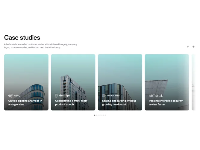
The section opens with a container holding the section title, supporting line, and previous/next arrow buttons aligned to the right on medium screens. Below, a Shadcn UI carousel shows constrained-width case study cards in a horizontal strip. Each card is a linked poster with full-bleed photography, a bottom gradient overlay, a company logo, and the story title. Soft left and right fade masks blend the carousel edges into the page background, hinting at more content off-screen. Dot indicators below let users jump to specific slides.
Cards have a minimum height on small screens and shift to a wider aspect ratio on larger breakpoints. Photography fills each frame, a multi-stop gradient from black to transparent keeps white text legible, and a subtle zoom on hover provides interaction feedback. The masks use color-mix in oklab for smooth transitions regardless of the page background color. Primary-colored dots mark the active slide position.
The overall feel is contemporary editorial with restrained chrome. No descriptions, excerpts, or read-more links clutter the cards, keeping the focus on the visual mark and headline. Complexity is moderate: the fade masks and carousel state are the main moving parts, while content is a simple flat list of items.
On mobile the carousel allows drag-free scrolling for natural touch exploration. The masks still apply, fading out at the start and end positions so the first and last cards render without clipping.