Case Studies 20 block design & features
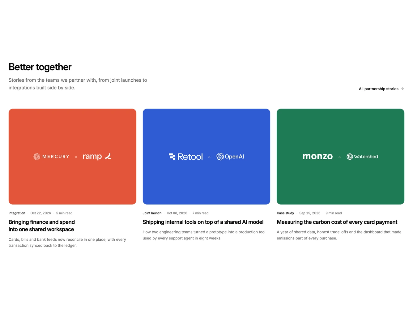
The block presents three partner stories in a grid under a heading, description and link to all partner stories. Each cover is a flat colour panel centred on two partner marks joined by a × sign.
Each partner mark is a white company logo image, passed in as props with its name for alt text and a height class so marks of different shapes balance optically. Below the cover, a meta line shows the story type, date and read time, followed by the title and a short summary.
Cards are fully clickable. On hover the title underlines, with no movement. The cover colours are fixed and saturated enough to keep the white logos readable in both light and dark themes.
On tablet the cards sit two to a row, and on mobile they stack in a single column.