
Case Studies 19 block design & features
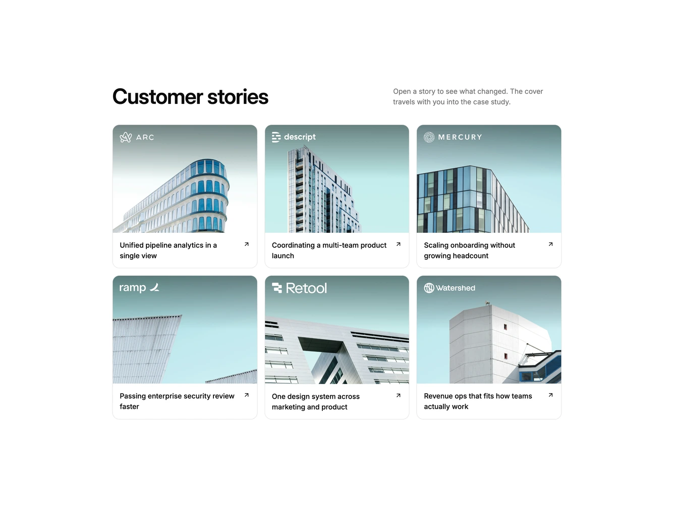
CaseStudies19 presents customer stories as cards that open in place. Built with shadcn/ui, it shows a heading and short description above a three-column grid of bordered cards, each with a 4:3 cover photo, the customer's logo in the top corner, and the story title with an arrow.
Clicking a card grows it into a large centered dialog rather than opening a separate modal. The cover stretches into a wide 16:9 header with the logo, the title moves into place, and the summary, a headline result with its label, and a read link fade in just after. Closing reverses the motion back into the grid, the page behind is dimmed and blurred while a story is open, and Escape, the close button, or a backdrop click all close it. Covers zoom slightly on hover.
The block feels fluid and app-like, a polished alternative to a plain case study grid. It shares its content shape with the case studies carousel, so the same logos, titles, summaries, and images can drive both, with an extra result and label per story.
The grid drops to two columns and then one on smaller screens.