
Careers 13 block design & features
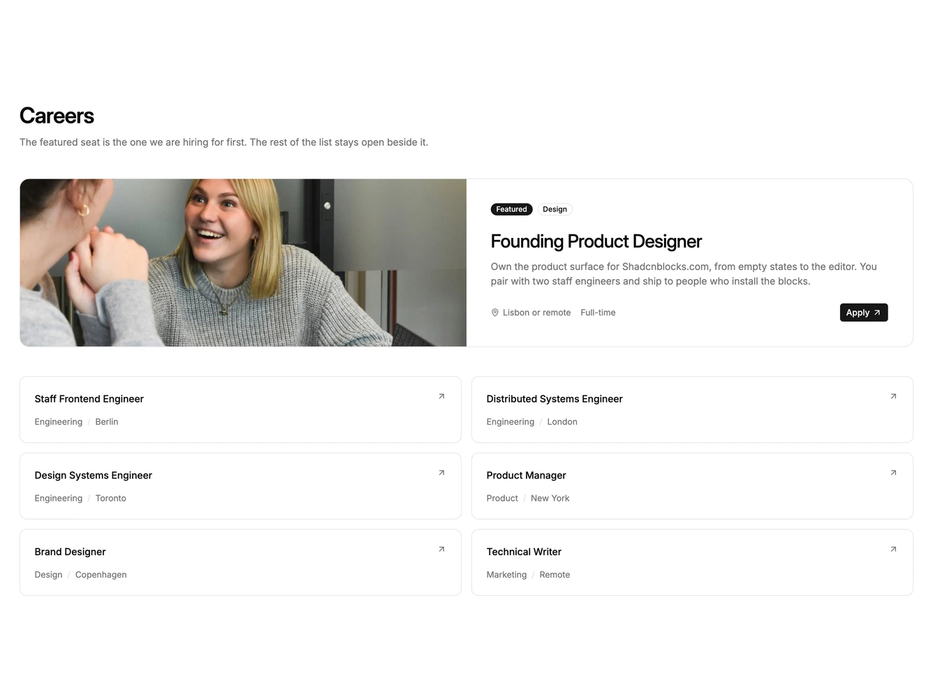
Careers13 is a featured-plus-grid careers block built with shadcn/ui badges. The priority seat is a two-column card: a tall workplace photograph fills the first column, and the heading, brief, location, and apply action sit in the second. Supporting roles follow as compact text cards in two columns.
The featured photograph is cropped flush to the card edge. The copy column uses the card surface, and the smaller listings use a hairline border. Hover tints the card. The featured title stays the largest type in the band.
This is a variation that makes the featured seat a split photograph rather than a faded image behind the copy. Complexity is moderate and content-driven. You need one portrait workplace photograph, a longer featured brief, and several shorter listings.
On small screens the photograph stacks above the featured copy, and the supporting cards fall into one column.