
Careers 11 block design & features
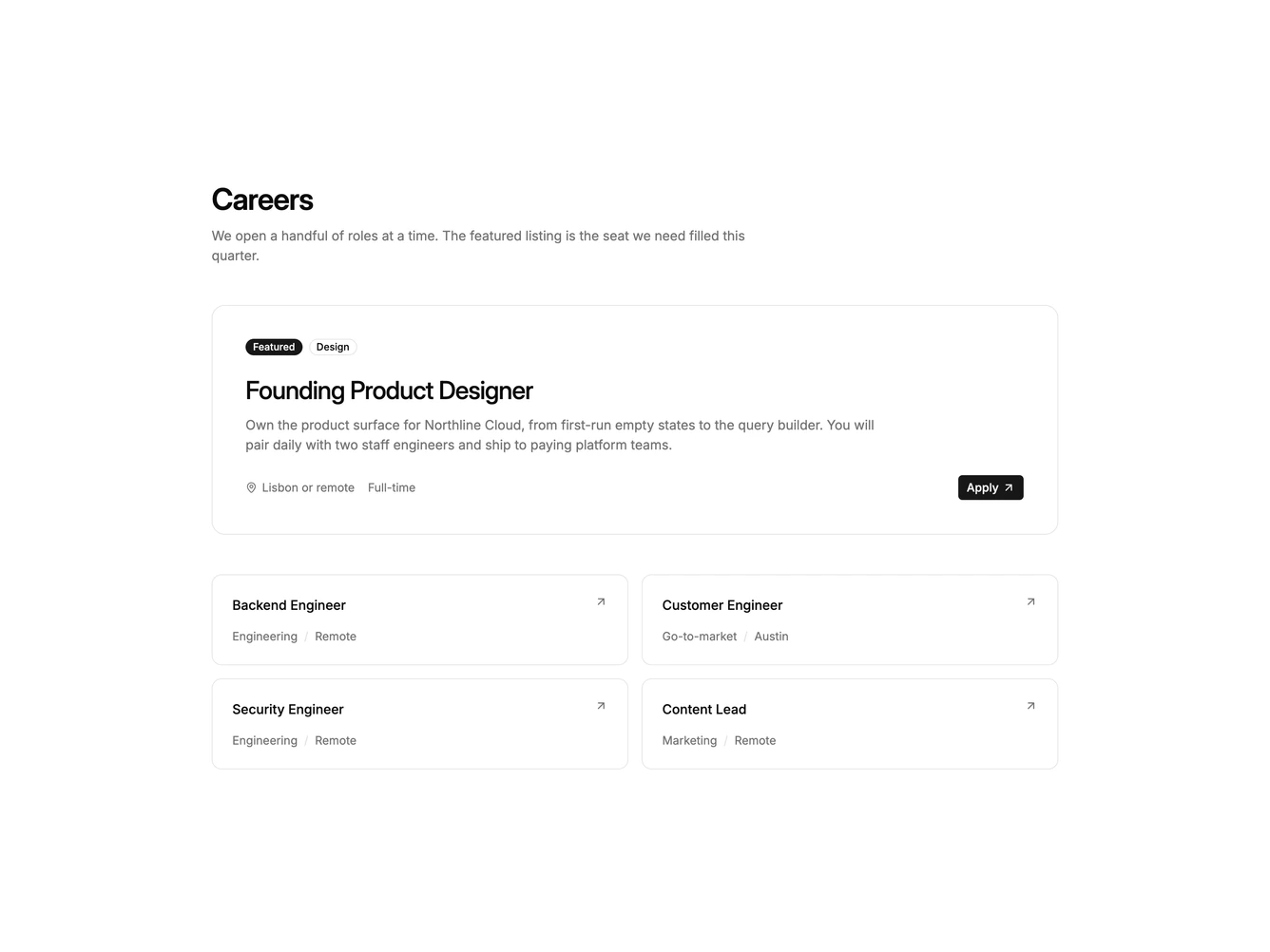
Careers11 is a featured-plus-grid careers block built with Shadcn UI badges and buttons. A short intro sits above one large linked card for the priority seat: featured and department badges, a longer brief, location, schedule, and a primary read action. Supporting roles follow in a two-column grid of compact cards with title, department, location, and a corner arrow.
Surfaces use card fill on the featured tile and hairline borders on the smaller tiles. A workplace photograph sits on the right of the featured card and fades out toward the copy. Hover tints the card background. Type is heading-led on the featured seat and quieter on the supporting grid.
The layout is a fresh take on a flat list: one role is visually heavier than the rest. Complexity is moderate and content-driven. You need a longer featured brief plus several shorter listings.
Supporting cards wrap to a single column on small screens. The featured card stays full width.