
Calendar 6 block design & features
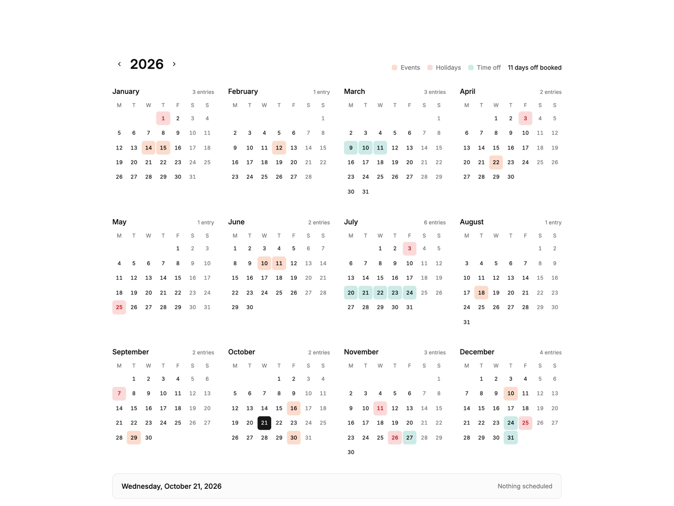
Calendar6 is a year at a glance calendar built with Shadcn UI Button. The year sits large with previous and next arrows beside a legend for events, holidays, and time off and a count of days off booked. Twelve mini months follow in a responsive grid, each with its name, an entry count, weekday initials, and a square cell for every date.
Dates with entries are tinted by type, today has a ring, weekends are muted, and selecting a date shows its full name and entry in a bar under the grid.
The style is orderly and print like, with small square cells and quiet color coding that keeps a whole year readable. Year views are less common than month views but simple to read. Content-driven: it needs holidays, events, and leave dates.
The month grid moves from four columns on wide screens down to one on phones.