
Calendar 5 block design & features
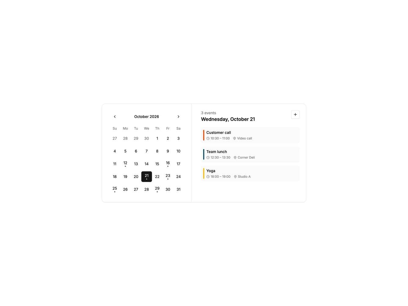
Calendar5 is a calendar card built with the shadcn/ui Calendar, Card, and Button components. The left side holds a single month date picker where days with events carry a small dot. The right side shows the event count and full date for the selected day, an add button, and a list of events with a colored accent bar, time range, and location.
Picking a date updates the list instantly, and a dashed empty state appears when the day is free.
The style is neat and contained, with a divided card, muted event rows, and the default calendar look. It is a straightforward pattern that reuses the standard date picker rather than a custom grid. Content-driven: it needs event titles, times, and locations.
On a narrow screen the calendar stacks above the event list.