
Calendar 3 block design & features
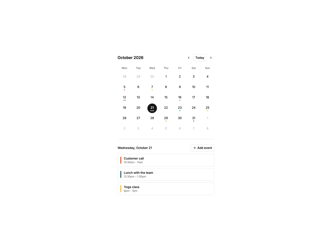
Calendar3 is a simple month calendar built with shadcn/ui Button, Dialog, Field, and Input. A narrow centered column holds the month title with previous, next, and today controls, a seven column grid of round date buttons, and a list of events for the selected day. Days with events show up to three small colored dots under the number.
Selecting a date fills the list below, and an add button or a double click on the date opens a dialog with the title, date, start and end times, and a calendar color. Clicking an event in the list opens the same dialog to edit or delete it.
The style is minimal and light, with round day buttons, a filled selected state, and generous spacing. It is a basic, familiar month view and a good starting point. Content-driven: it needs event titles, dates, and times.
On a narrow screen the column simply fills the width.