
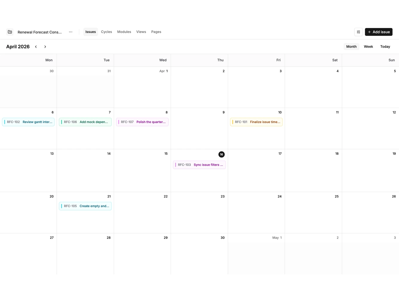
Calendar 1 block design & features
Calendar1 is a full height calendar built with shadcn/ui Button, Sheet, Field, Input, and Textarea. A single header shows the month or week range with previous and next arrows and a month and week switch. Below it, a weekday row sits above a grid of day cells where each event is a tinted chip with a colored calendar bar, its start time, and title.
Clicking empty space in any day opens a side sheet with the date filled in, and the hover link in each cell does the same. The sheet takes a title, notes, date, start and end times, and a calendar color, and clearing both times saves an all day event. Clicking a chip reopens it for editing or deleting, and dragging a chip onto another day moves it.
Colors come from the theme chart palette, so the calendar follows light, dark, and custom themes. The look is calm and roomy, with a muted weekday band and hairline cell borders. Content-driven: it needs event titles, dates, and times.
On a narrow screen the grid keeps its seven columns and scrolls sideways.