
Blog 63 block design & features
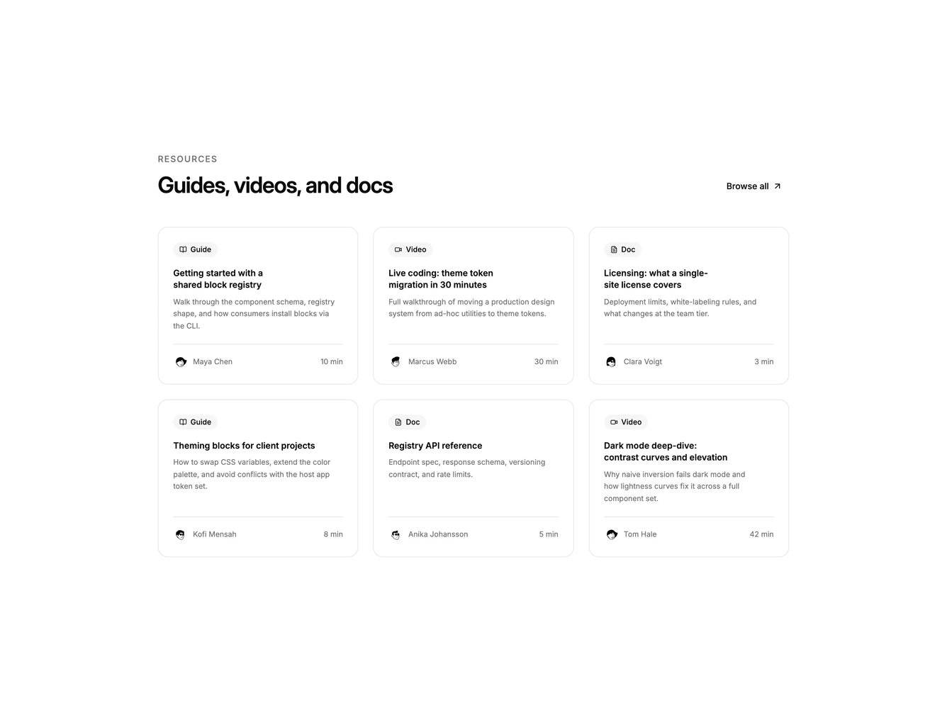
Blog63 is a three-column resource grid built with the shadcn/ui Button. The header pairs the section heading with a ghost "See all articles" button and an up-right arrow, aligned to the far side on wider screens. Six cards follow, each with a title and a small arrow in the top corner, a summary clamped to two lines, and a footer row with a round author avatar, the author's name, and the read time pushed to the right.
Cards use a card-colored surface with a hairline border and rounded corners, and a second hairline separates the footer from the body. That internal rule is what sets this block apart from its outlined siblings. Type steps down clearly: a semibold title, a muted relaxed summary, a medium-weight author name, and a faint read time. The title underlines on hover and the corner arrow darkens from muted to foreground when pointed at directly; the card itself stays still. No entrance animation.
This is the most complete card in the minimal grid family, closer to a documentation or resource hub than a bare post index. It remains flat and quiet, with no imagery beyond avatars. Complexity is moderate and content-driven: each entry needs a title, a short summary, an author with a headshot, and a read time.
The grid steps from three columns to two on medium screens and one on mobile, and the browse button drops below the heading on small screens.