Blog 60 block design & features
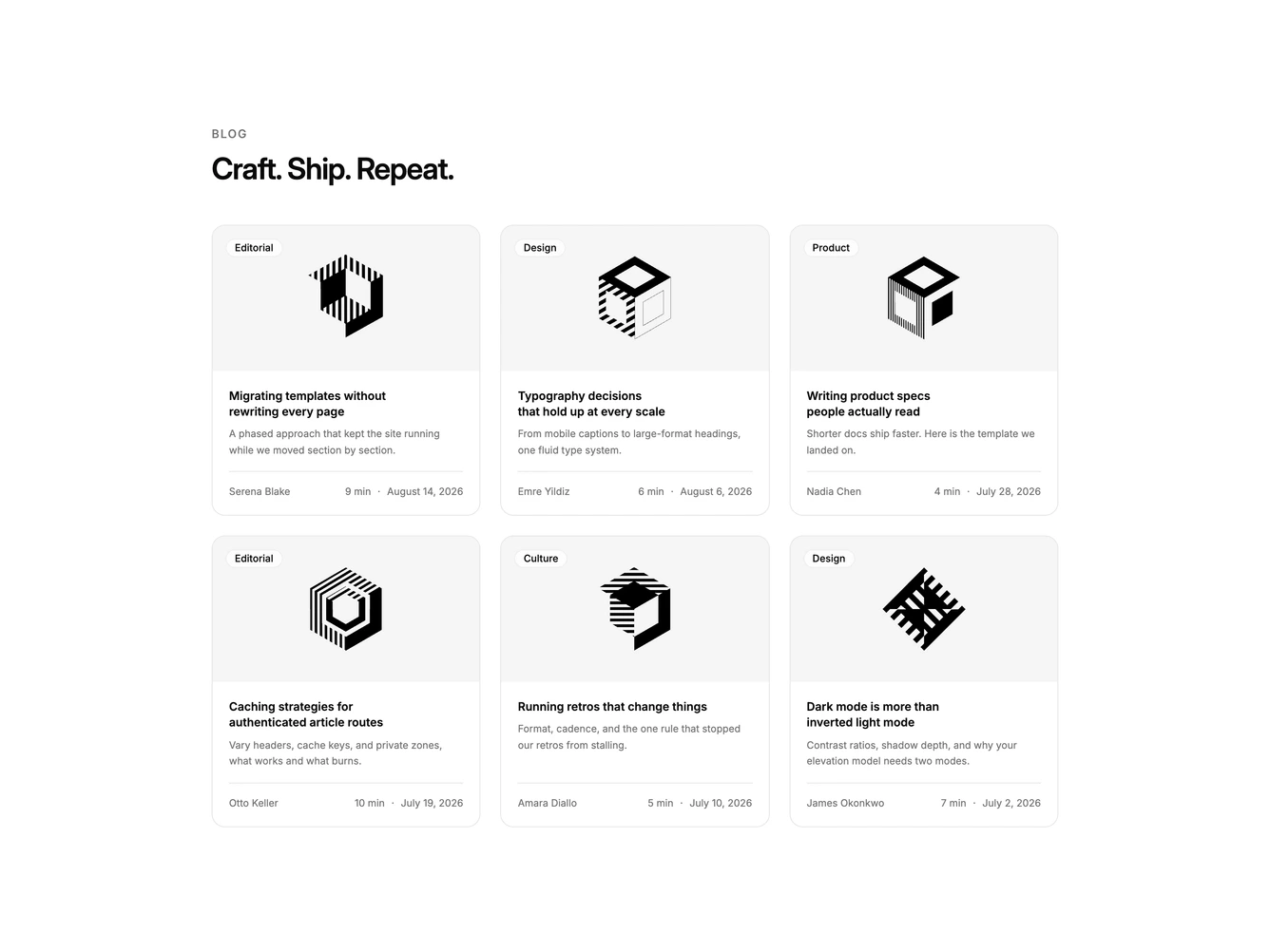
Blog60 is a three-column grid of six article cards built with Shadcn UI, introduced by a plain section heading. Each card opens with an edge-to-edge 16:9 cover carrying a category pill in its top left corner. Below the photo sit the title, a full excerpt, and a footer row with the author name on the left and the read time and date pushed to the right.
Hairline borders, a card background, and large rounded corners frame each post, with the cover clipped flush to the top edge. The category pill is a small translucent chip with a light blur so it stays legible over photography. A hairline divider separates the body from the footer, where the medium-weight author name leads a fainter read time and a muted date. Hovering the cover dims it and fades in a round arrow badge in the top right corner, and the title underlines on its own hover.
The fade-in arrow is what sets this apart from the other bordered grids in the family, a small cue that the photo is a link. Otherwise it is a composed editorial card with a little more framing than most siblings, thanks to the overlay pill and divided footer. Complexity is moderate and image-driven: each post needs a cover, a category, an author name, and an excerpt.
Excerpts are not clamped, so cards with longer summaries grow taller while the footer stays pinned to the bottom. The grid drops to two columns at small widths and one column on phones.