
Blog 51 block design & features
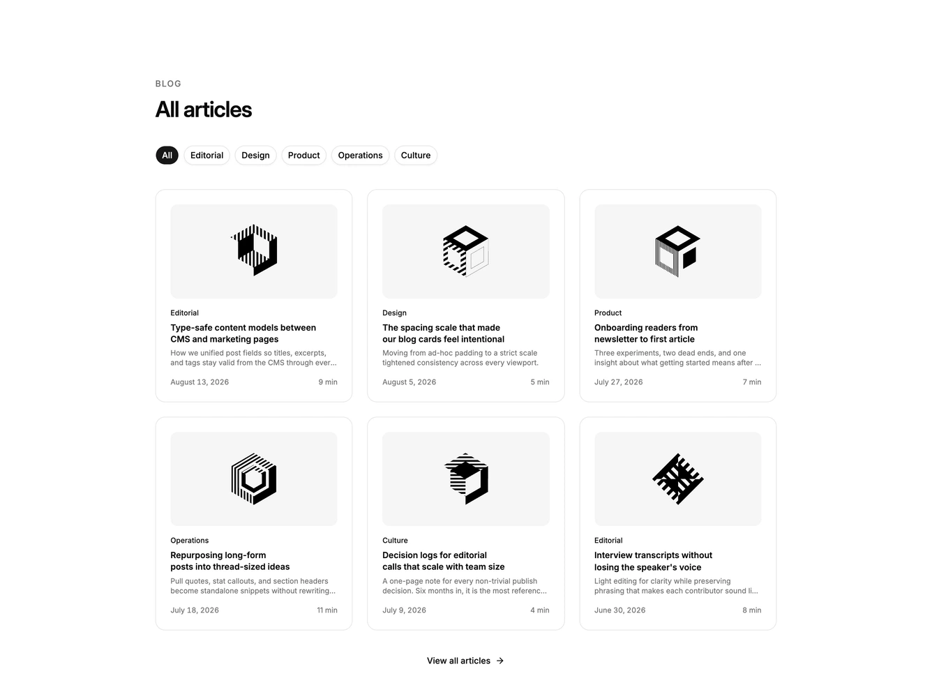
Blog51 is a filterable article grid built with shadcn/ui, with a row of Button filters directly under the section heading. Choosing a category narrows a grid of up to six cards, three columns wide on large screens. Each card holds a 16:9 cover photo, a small uppercase category label, the post title, a two-line excerpt, and a footer with the date on the left and the read time on the right. When a category has no posts, a centered muted message takes the place of the grid, and a text link with an arrow sits centered below everything.
The active filter is a filled button and the others are outlined, so the current selection reads at a glance. Cards are bordered, padded, and generously rounded, with the cover inset inside the padding on its own rounded frame. Meta steps down from the semibold title to a muted date and a fainter read time. Hovering the cover dims it slightly and hovering the title underlines it, while the footer link underlines and its arrow darkens. Nothing animates on entry.
Among the three-column card grids, this is the one with client-side filtering, which makes it feel like a working archive rather than a showcase strip. The styling is restrained and neutral, close to default shadcn. Complexity is moderate: the filter state lives in code, but the block only feels complete with real posts spread across several categories, each with a cover image.
The grid drops to two columns at small widths and one column on phones, and the filter row wraps as needed. Filtering applies to the first six posts only.