

Blog 30 block design & features
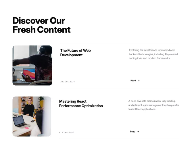
Blog30 is a heading-led blog row section built with Shadcn UI Card components. A single large heading opens the section, with no description beneath it, followed by up to five rows separated by open space. Each row places a large square image on the left and a text area on the right that splits into two columns on large screens: a big linked title with a muted date beneath it on one side, and the summary with a "Read" link and arrow on the other.
Visually, the square art carries the weight. Its corners are noticeably rounder than the other row blocks, giving the images a softer, tile-like shape, and a wide gap separates image from text. Titles step up to the largest row size, and the meta is reduced to a single muted date with no author or badge. Hovering the image dims it slightly, the title underlines independently, and the arrow on the Read link darkens. The rows are static on load.
The split text area is what sets this apart in the family, reading more like a magazine contents spread than a feed. It is image-driven and fairly simple: each post needs a strong square image, a title, a date, and a short summary.
On phones the image is capped in width and centered above the text. From medium screens up the image and text sit side by side, and the title and summary separate into their own columns from large screens up.