
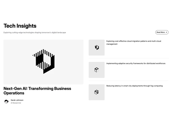
Blog 22 block design & features
Blog22 is a two-column feature section built with shadcn/ui Avatar and Button components. The header pairs a large heading and description on the left with an outline button and arrow on the right. Below, the left column holds the lead post: a 16:9 cover, a large title, and an author block with a round avatar, name, and role. The right column lists three posts as rows, each with a square thumbnail beside the post summary, which serves as the link text.
Hairline dividers separate the right-hand rows, and their summaries sit in muted gray at body size, so the column reads quieter than the lead. Thumbnails have small, tight corners while the lead cover uses a softer radius. The byline steps from a medium-weight author name down to a muted role line. Hover is understated: images dim slightly and the title or summary text underlines. The section is static, with no entrance motion.
The tone is restrained and editorial, closer to a newsletter digest than a card grid. It is unusual in this family because the secondary posts show an excerpt instead of a headline, which gives the list a conversational feel but means each summary has to stand on its own. Complexity is low to moderate: four images, one author photo, and short, self-contained summaries.
Below tablet widths the two columns stack with the lead on top, and the header button drops beneath the heading. Thumbnails keep a fixed share of each row so the list stays aligned at every size.