Blog 21 block design & features
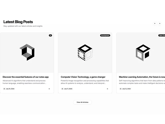
Blog21 is a full-width blog carousel built with Shadcn UI Carousel, Button, and Badge components. A heading and description sit on the left of the header with two round outline arrow buttons on the right. Below, the carousel extends beyond the content container toward the viewport edges and shows bordered post cards with a 4:3 image, a filled category badge in the top-right corner, a two-line title, a two-line excerpt, and a footer with the date and an arrow icon. A centered outline button sits under the track.
Cards have a light surface, hairline borders, and rounded corners that clip the image flush to the top edge. The dark badge is the strongest accent against otherwise neutral, muted text. Titles are semibold, excerpts and dates sit in muted gray. Hovering the image dims it slightly and hovering the title underlines it, while the small arrow darkens on hover. There is no entrance animation.
A conventional card carousel made more expansive by letting the track run past the container. Among the carousel variants it is the only one with a closing view-all button, and its badges sit on the right of the image rather than the left. Moderate complexity, needing a handful of posts with images, categories, summaries, and dates.
The carousel loops and shows one card on phones, two on tablets, and three on desktop. On mobile it switches to free-scrolling drag rather than snapping card by card.