
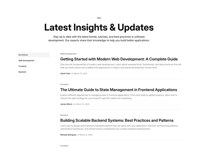
Blog 17 block design & features
Blog17 is a filterable blog feed built with Shadcn UI Button components. A left-aligned heading and description sit above a four-column grid: the first column holds a vertical list of ghost category buttons, and the remaining three hold the posts. Choosing a category narrows the list in place, with the first option showing everything. Each row pairs a small 16:9 thumbnail on the left with an uppercase category label, linked title, summary, and an author and date byline, and the feed holds up to ten posts.
Hairline dividers sit between rows only, so the first post aligns flush with the top of the filter column and the last has no rule beneath it. The active filter takes a soft secondary fill while idle filters stay transparent. Meta is understated: the category is a small tracked uppercase label in muted gray rather than a badge, and the byline sets a medium-weight author name against a muted date behind a faint dot. On hover the thumbnail dims slightly and the title underlines. There is no read-more link and no entrance animation.
The arrangement is utilitarian and minimal, keeping a conventional header-over-content order with a quiet filter rail beside the feed. Compared with Blog37, which moves the heading into a sticky sidebar and adds badges and read-more links, this version has a lighter meta line. Complexity is moderate: it holds client-side filter state, and every post needs a category that matches one of the filter values, along with a thumbnail, summary, author, and date.
The filter column only appears on large screens. On smaller widths it is hidden and the full list shows unfiltered. Rows stack the thumbnail above the copy on phones and sit side by side from small screens up.