Blog 14 block design & features
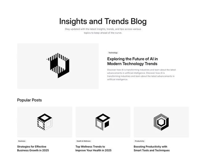
Blog14 is a two-tier feature section built with Shadcn UI badges, opening with a centered heading and supporting paragraph. The lead story sits in two columns: a 16:9 cover image on the left and, on the right, a category badge, a large headline, and a longer summary. A smaller subheading then introduces a row of three supporting posts, each stacking a 16:9 image, category badge, title, and two-line excerpt.
Cards are borderless, with no borders or fills, so the rounded images and generous whitespace carry the structure. Headings are semibold, the lead title sits a clear size step above the row titles, and summaries are set in muted gray with relaxed line height. Badges use the soft filled style throughout. The cover and the title are separate links: the image dims slightly on hover while the title underlines. There is no entrance animation.
The look is calm and magazine-like, leaning on spacing rather than decoration. What sets it apart from its siblings is the centered intro and the labeled second tier, which reads like a "more stories" shelf beneath the main feature. Complexity is moderate and content-driven: it needs four cover images plus a category and summary for each post.
On mobile the lead split stacks image over text and the supporting row collapses to a single column, returning to three columns from tablet widths up.