
Blog 13 block design & features
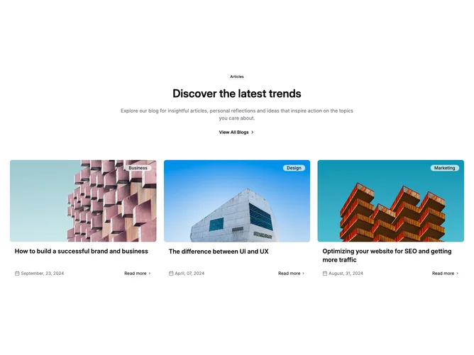
Blog13 is a centered three-post article grid built with shadcn/ui Badge. The header centers a heading, intro paragraph, and a view-all text link with a chevron. Each post shows a 4:3 cover with the category as a badge floating in the top right corner of the image, then a linked title, and a bottom row with a calendar-icon date on the left and a read-more link with a chevron on the right.
The category badge has a translucent background with a backdrop blur, so it reads as frosted glass over the photo. Cards are borderless, with rounded covers and roomy gutters. Titles are semibold, dates are muted with a small calendar icon, and the read-more link is medium weight with a muted chevron that darkens on hover. Covers dim slightly and titles underline on hover as separate links. No entrance animation.
The overlay badge is the signature detail and gives this grid a slightly more magazine-like feel than the badge-above-title variants. Leaving out summaries keeps cards short and image-led. Low complexity, with content needs limited to a cover photo, category, title, and date per post.
Posts stack on mobile, move to two columns at medium widths, and three on large screens. The date and read-more row sits directly under the title.